
Designing Better Partner Airline Experiences
Nov 30, 2025
⏱️ Reading time: 4 minutes
The Challenge
Code-share flights: passengers book with one airline but fly with another. This creates a unique design challenge at the intersection of two brand ecosystems.
I recently experienced this on a British Airways booking operated by Vueling, which revealed significant opportunities for UX improvement through growth design thinking.
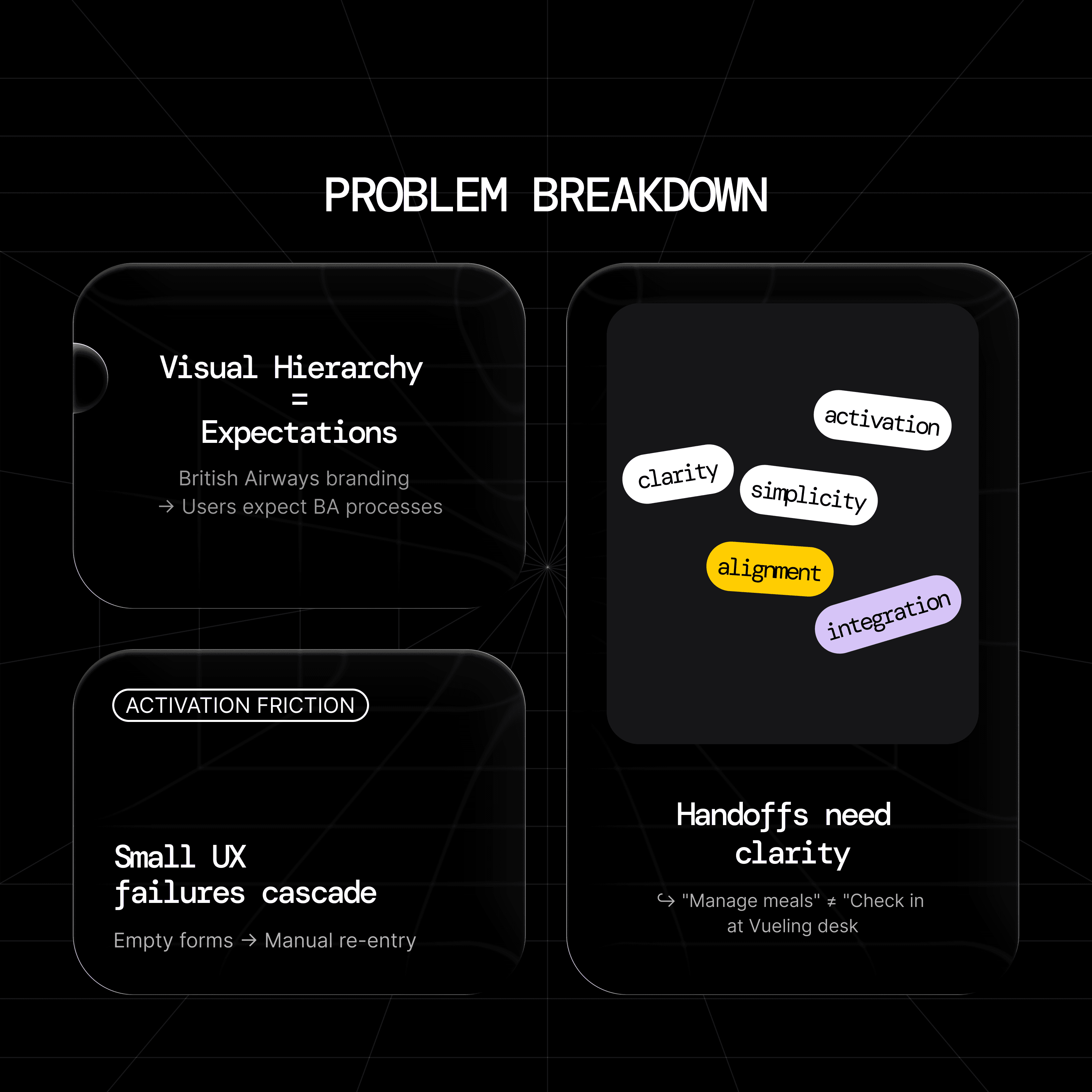
Three Core Problems
Visual Hierarchy Misalignment
The Issue:
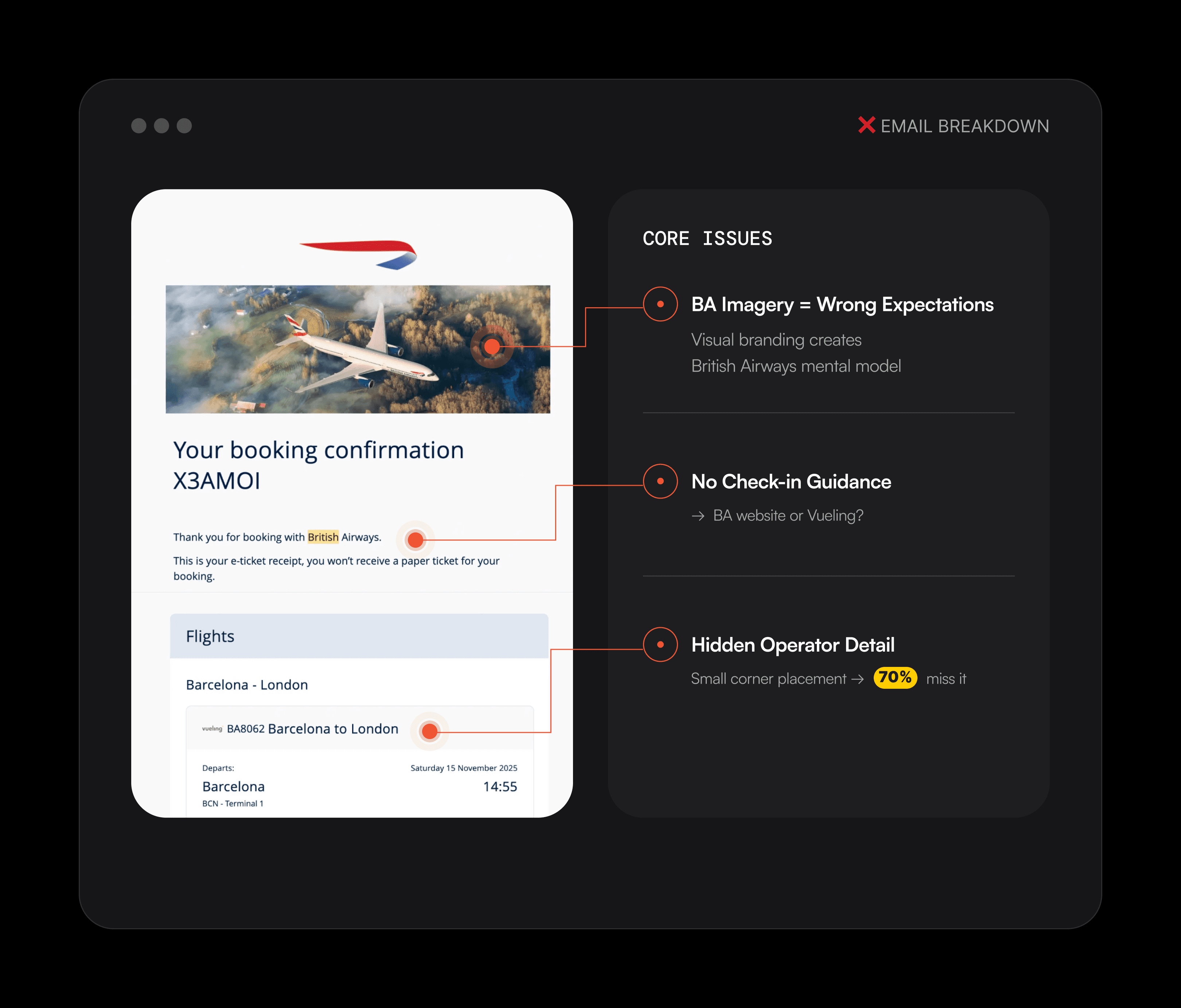
When British Airways branding dominated the confirmation email, I naturally expected BA processes at the airport. The critical detail-"Operated by Vueling"-appeared in small gray text, easy to miss.
Impat
Users go to wrong check-in desks
Support burden increases
First-time success drops
Information Architecture Gaps
Wayfinding-critical information (which airline desk to find) received less prominence than ancillary details (meal preferences, baggage rules).
✨Prioritize activation-critical content over optional features.
Handoff Friction
The transition from BA's ecosystem to Vueling's lacked clear design. I didn't know which website to use for check-in or where information would transfer.
✨ Handoffs are high-friction moments. Users need explicit guidance at transition points.
Impact:
Multiple failed attempts
Manual data re-entry
Conversion barriers at critical moments
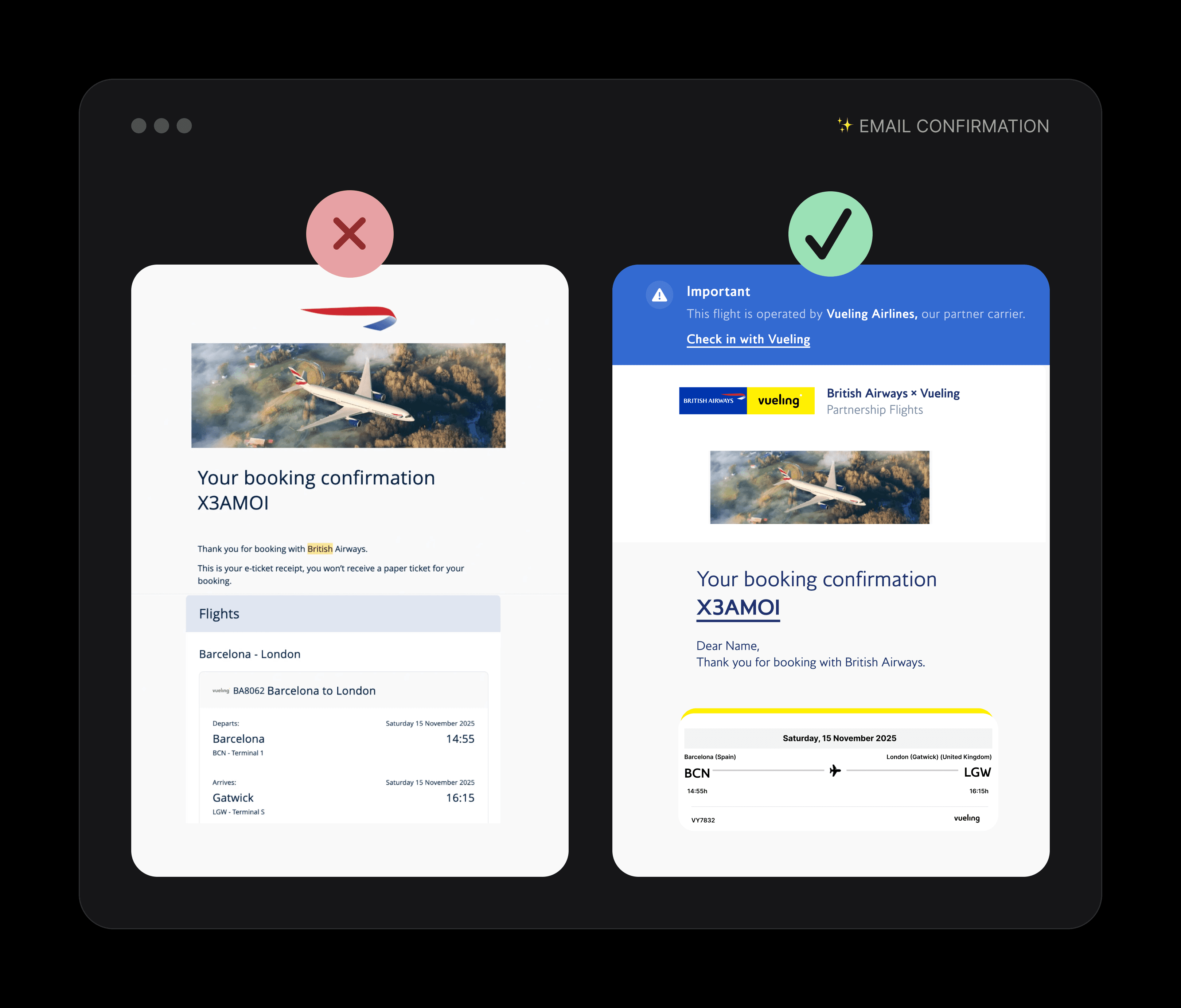
→ Activation-Focused Email Design
Key Changes:
Prominent blue banner: "Important: Operated by Vueling Airlines"
Dual-brand presence (equal visual weight)
Clear CTA: "Check in with Vueling" (not generic "Manage booking")
Visual distinction: BA blue for booking, Vueling yellow for operations
→ Proactive Notification System
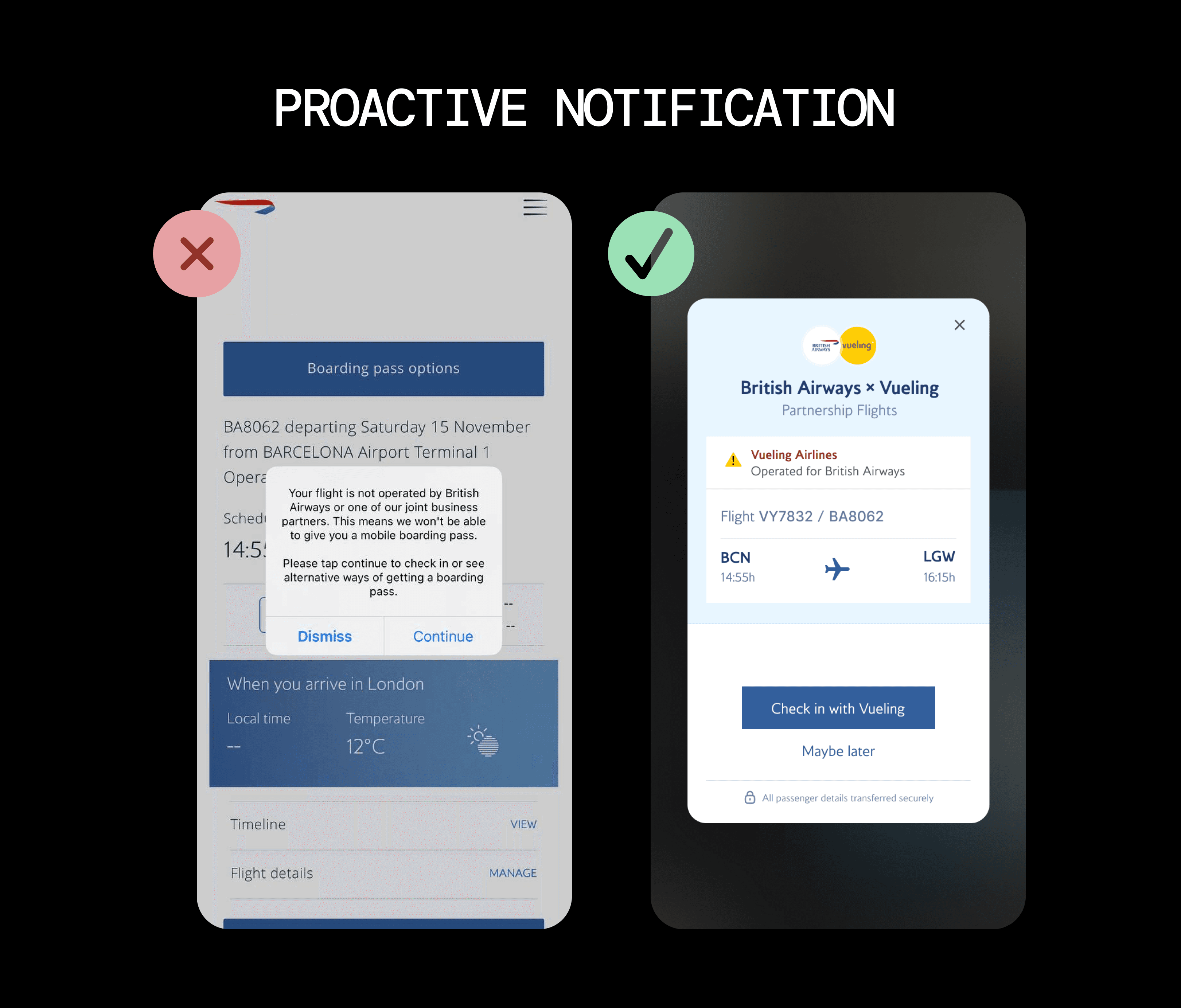
Implementation:
Modal notification 24 hours before departure
Operator information front and center
Direct link to correct check-in (no navigation needed)
Pre-filled data (zero manual re-entry)
✨One well-designed notification prevents hundreds of support contacts.
📊 Proactive communication scales better than reactive support.
Seamless Data Integration
Secure handoff between partner systems
Single sign-on where possible
Pre-populated forms
Transparent transfer with user consent
✨ Every manual re-entry point is an opportunity for errors and abandonment. Remove friction through intelligent integration.
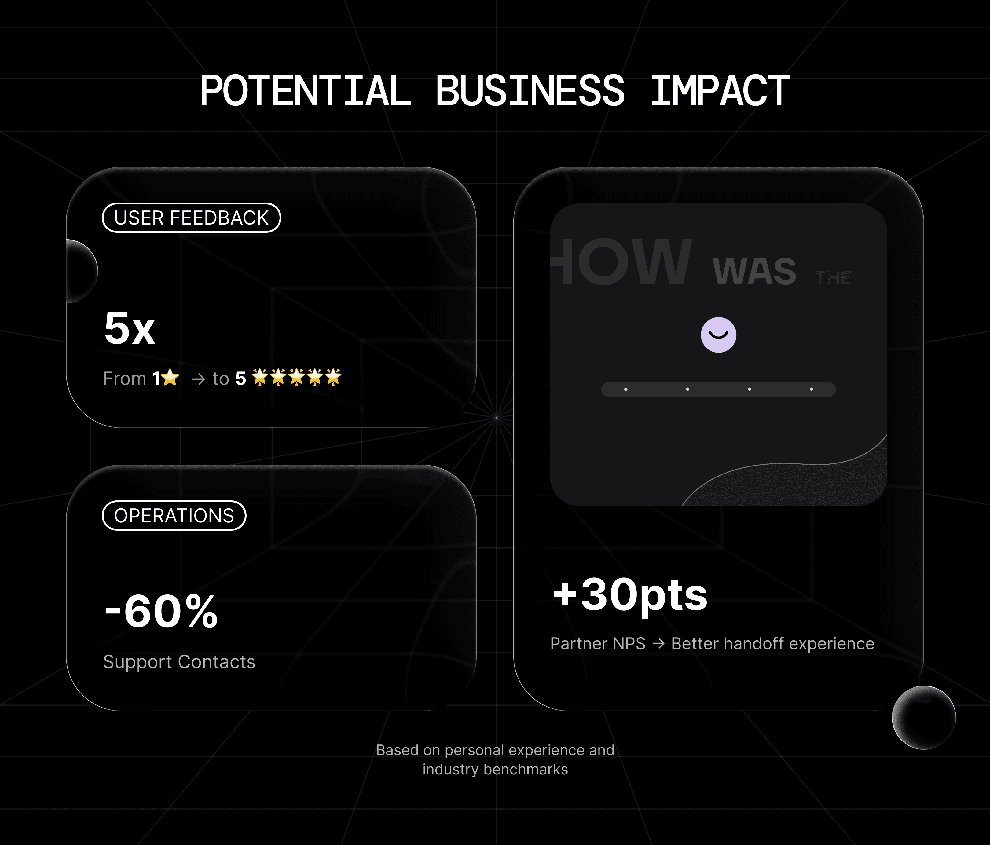
Projected Impact
Based on Nielsen Norman Group, IATA, and Gartner research:
Activation Metrics
First-Time Success: +40%
From ~30% find correct desk immediately to ~70% direct to correct location
Efficiency Metrics
Support Contacts: -60%
Proactive clarity reduces "where do I check in?" inquiries.
Staff can focus on complex issues, not repetitive questions.
Experience Metrics
User Clarity: 5x improvement
From 1-star confusion to 5-star understanding
Partner NPS: +30 points
Clearer handoffs improve satisfaction with both brands. Based on Bain research: major UX improvements drive 20-40pt gains.
Note: Projected based on industry benchmarks. Validation requires testing.
Beyond Airlines
These principles apply to any multi-brand journey:
Fintech:
Payment processor handoffs
Banking partnerships
Buy-now-pay-later integrations
E-commerce:
Marketplace to seller transitions
Third-party fulfillment
Cross-brand checkout flows
B2B2C:
Software integrations
White-label products
Platform ecosystems
✨ Wherever multiple brands share a customer journey, intentional handoff design creates value.
Key Takeaways
For Designers:
Partner experiences aren't edge cases-they're growth opportunities. Handoffs deserve dedicated design attention.For Product Teams:
Multi-brand journeys require cross-organizational collaboration. Align on shared metrics and design standards.For Growth Teams:
Activation friction at transition points often goes unmeasured. These moments represent high-leverage optimization opportunities.Universal Truth:
When two brands share one journey, the handoff isn't just technical integration- it's a critical conversion moment.
Methodology
This case study combines personal experience observation, industry research (Nielsen Norman Group, IATA, Gartner), growth design best practices, and metric-driven design decisions.